
Author
ITC –M. Begoña Arenas
Mini Project ID
ITCMP03
Description
The case: My project is based on analyzing different innovative products entrepreneurs have issued to promote the development of deprived areas in my region. I already have the data, but I want to find the correct chart to compare the evolution of sales for the 5 products in 3 years (2017, 2018 and 2019).
I am doing this exercise in the frame of a Continuing professional development course and I would like to show trends in time.
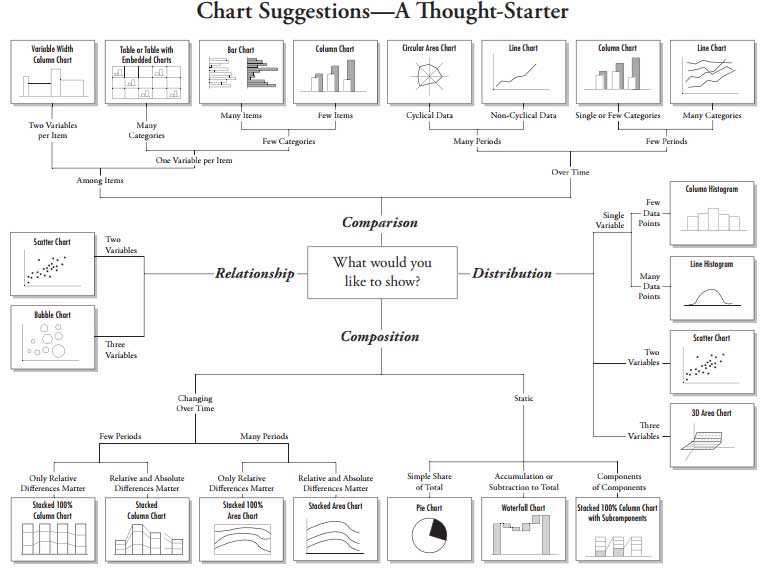
The following chat can serve as a guide to select the right chart depending on where we want to make the focus.
Sector
VET
Data
| #PRODUCT/YEAR | 2017 | 2018 | 2019 |
| Product 1 | 25 | 30 | 65 |
| Product 2 | 10 | 8 | 9 |
| Product 3 | 45 | 50 | 51 |
| Product 4 | 21 | 30 | 32 |
| Product 5 | 3 | 4 | 6 |
Model
Calculation
I finally select the “over time” option and try with 2 different charts: a line chart and column as both fit for few periods:
Graph 1: Line chart

You can see in vertical the number of items sold per category of product and in horizontal, the evolution of the sales in the different years.
Graph 2: Column chart
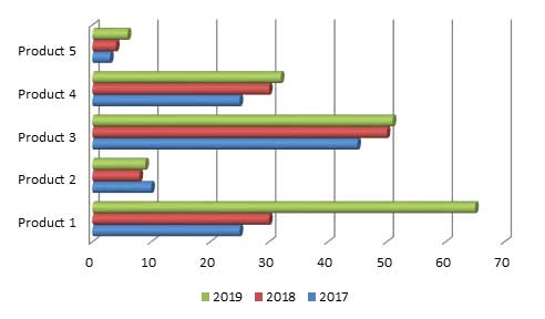
Graph 2: You can see the different products in the vertical axis and the and number of items in horizontal. The years are shown in different coloured columns.
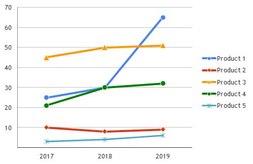
Very good example to use line charts. I like it.